Brand Design · Identity System · 2024
CovenantIQ
Brand Identity System
Designing the complete visual identity for a fintech startup — from logo mark and color system through an interactive brand guidelines site, giving every person who touches the brand the tools to represent it correctly from day one.
3
Logo variants — full wordmark, abbreviated CiQ, standalone icon mark
22
Sections in the interactive brand guidelines — from logo misuse to voice & tone
2
Typefaces — Crimson Pro for display, Figtree for body and UI
The Brief
Building trust in a market defined by legacy institutions
CovenantIQ was entering a market dominated by regional banks and established financial institutions — a world where trust, accuracy, and professionalism signal credibility. As the company's first designer and founding team member, I was responsible for building the complete brand identity from scratch, concurrent with designing the product itself.
The brand needed to accomplish three things at once: convey the intelligence and analytical power of the platform, feel trustworthy and credible to enterprise banking buyers, and differentiate CovenantIQ from legacy, spreadsheet-era tools. The name itself provided a strong starting point — covenant (contractual, precise, binding) and IQ (intelligent, analytical) — and became the conceptual foundation for the visual language.
Beyond the visual identity itself, the deliverable needed to be actionable. The brand guidelines couldn't be a static PDF that engineers and marketers would ignore. I built the guidelines as an interactive site — structured so designers, engineers, marketers, and agency partners could each find exactly what they needed without interpretation.
"The brand couldn't feel like another generic fintech startup. It needed to signal precision and intelligence to people who spend their days managing risk."
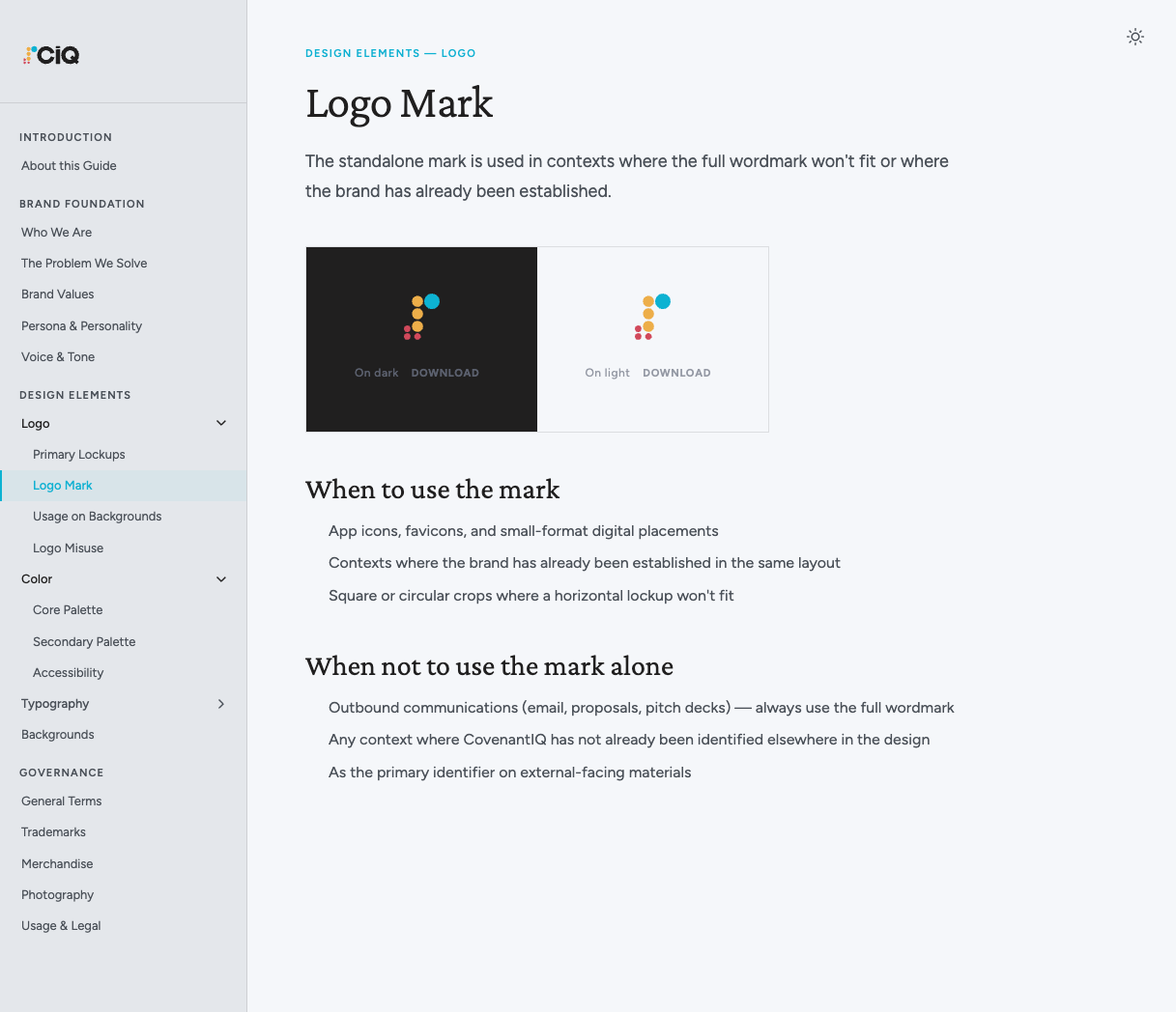
Logo mark in the guidelines site — The standalone abacus icon mark, documented for contexts where the full wordmark won't fit or where the brand has already been established. Includes dark and light variants with downloadable SVG files, and explicit guidance on when — and when not — to use the mark alone.
The Concept
The abacus as a symbol of calculated intelligence
The abacus icon mark is the conceptual heart of the brand. An abacus is one of humanity's oldest calculation tools — precise, systematic, and deliberate. For a platform built to bring accuracy and intelligence to covenant monitoring, the metaphor was exact. The abstract, geometric rendering of the abacus keeps it contemporary without losing the underlying meaning.
The icon is composed of three columns of circles in the brand's three accent colors — teal, amber, and rose — at graduated scales. This structure gives the mark a sense of hierarchy and data structure, echoing the layered, analytical nature of the product. At small sizes (app icon, favicon), the geometry remains legible. At large display sizes, the abstract quality becomes a strength.
The logotype is set in Figtree Semibold — a geometric sans-serif that pairs the lowercase "i" in IQ with a deliberate optical adjustment, creating a distinctive "iQ" ligature that becomes a recognizable trademark detail.
The Guidelines Site
A living document, not a static PDF
Most brand guidelines die in a Google Drive folder. I built the CovenantIQ brand guidelines as an interactive site — with structured navigation, section-by-section content, and downloadable asset files — so that every person who touches the brand could navigate directly to what they needed without emailing a designer.
The guidelines are organized into three sections: Brand Foundation covers mission, values, persona, and voice & tone. Design Elements covers the full visual identity system — logo lockups, logo mark, usage rules, misuse examples, color palettes, typography, and background templates. Governance covers usage policies, trademark rules, merchandise guidelines, and legal terms.
Each design element section includes the asset displayed in context, specific do/don't rules, downloadable SVG files, and implementation specifications ready for engineering handoff. Color values are documented with both hex and RGB formats; typography is specified with exact size, weight, line height, and tracking values.
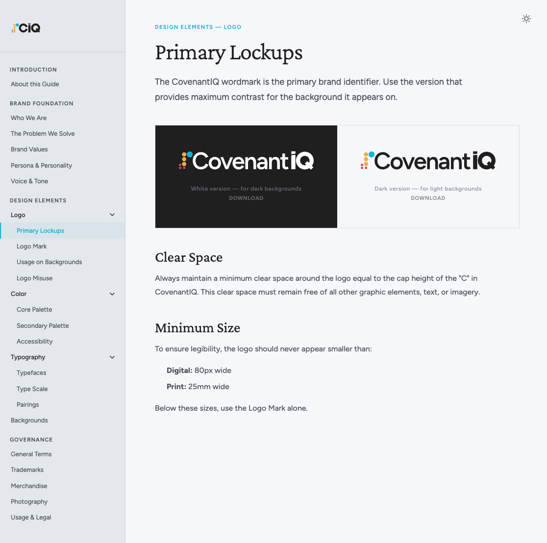
Logo Lockups in the guidelines site — Each logo section displays the asset on its correct background with a downloadable SVG file. Clear space is defined as the cap height of the "C" in CovenantIQ; minimum size is documented separately for digital (80px) and print (25mm) use.
Brand Foundation
Finance people building for finance people
Before designing a single element, I wrote the brand foundation — the principles that would govern every design decision. CovenantIQ's brand personality is anchored in a three-word phrase: "We're finance people." It means the team has direct operational experience in credit, has managed covenant compliance by hand, and understands the stakes of this work at a level that outside consultants don't.
Six brand values — Innovative, Opinionated, Customer-centric, Accurate, Trust, and Teamwork — each carry a specific definition in a lending context. Accuracy isn't generic; it means a misclassified covenant or a late alert has real financial consequences. Trust isn't abstract; it means showing calculations so customers can verify the work. These definitions kept every downstream decision grounded in the product's actual domain.
Voice attributes: Confident (assertive, not arrogant) · Friendly (approachable, not casual) · Intelligent (substantive, not dense) · Helpful (practical, not prescriptive)
The voice guidelines were designed to be immediately usable. Each of the four voice attributes includes a live product copy example so writers could hear the voice before applying it: "Fixed charge coverage dropped to 1.12x — below the 1.25x minimum. Driven by a $340K increase in capex in Q4." That's the Intelligent voice attribute in one sentence — precise financial language, no overexplaining, shows the calculation.
Color System
A three-accent palette with full semantic coverage
The color system is built around three primary accent colors — CIQ Cyan (#0EB1D2), Amber Gold (#EDAE49), and Coral Red (#D1495B) — each with seven shades for full UI flexibility. These three hues appear in the icon mark and carry throughout the product interface as semantic color indicators: cyan for primary actions and data, amber for warnings and highlights, coral for alerts and critical states.
The neutral scale uses nine steps from white (#FFFFFF) to near-black (#111110), with a warm undertone that prevents the UI from reading as cold or clinical. All text/background pairings were tested for WCAG 2.1 compliance — ten pre-approved combinations are documented in the guidelines accessibility table, with contrast ratios ranging from 4.8:1 (AA) to 17.2:1 (AAA).
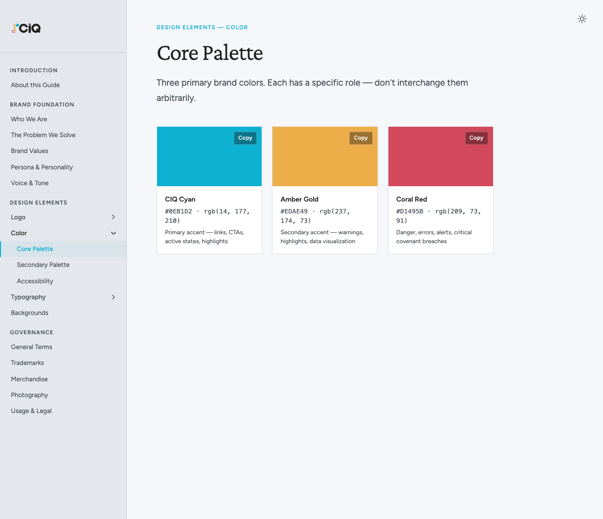
Core palette in the guidelines site — The three primary accent colors with hex values, RGB values, and their semantic roles. Each color is documented with a one-line usage rule — not interchangeable — to prevent arbitrary color substitution as the team grows.
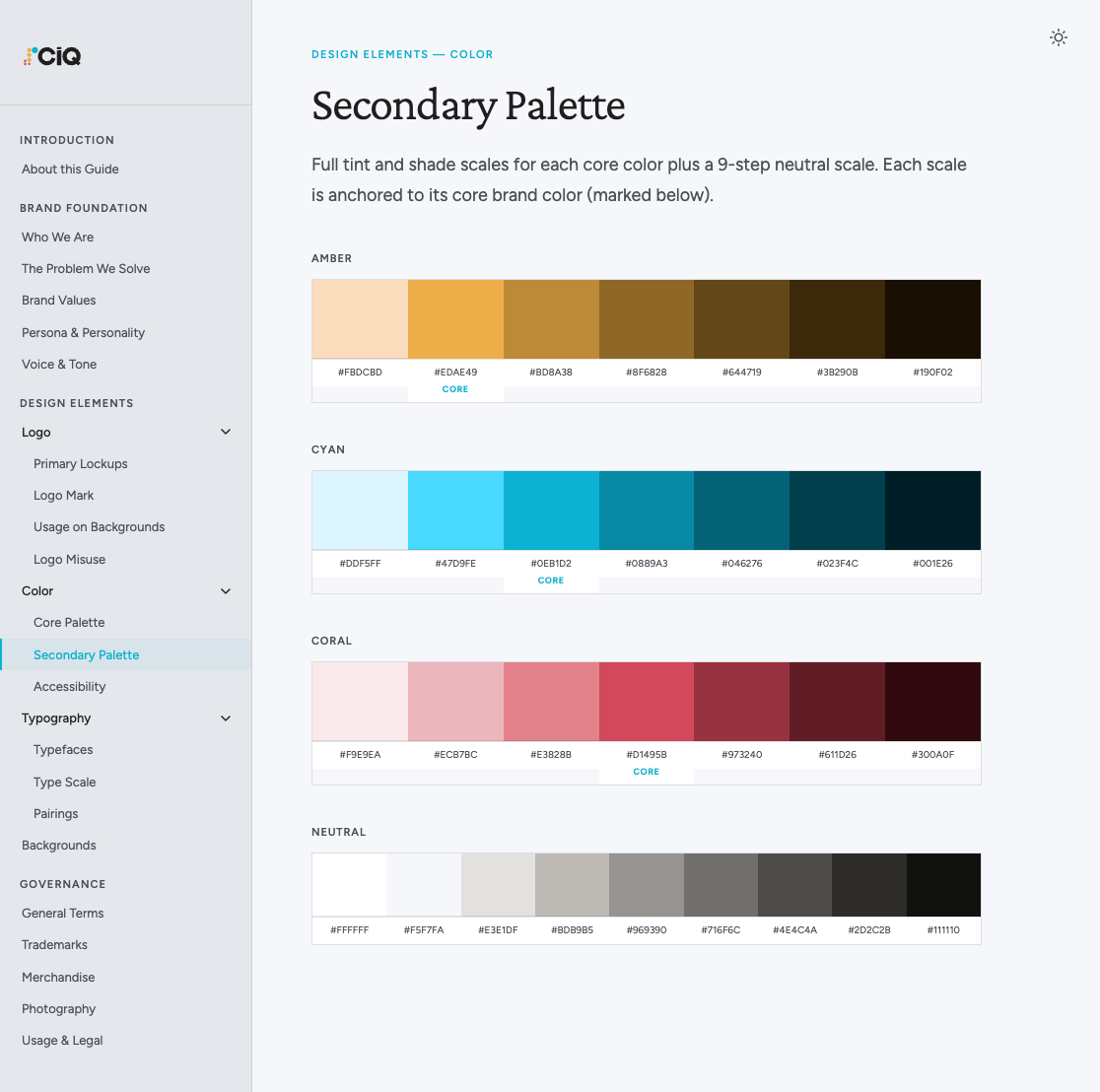
Full color scales — Seven shades per accent color plus a nine-step neutral scale. Each core color is anchored at its mid-point and labeled. The guidelines site lets users copy any hex value with a single click — a small detail that meaningfully reduces friction during engineering implementation.
Typography System
Crimson Pro for display, Figtree for everything else
The type system is built on two purpose-specific typefaces. Crimson Pro — a refined old-style serif with excellent legibility at display sizes — handles all section headings, panel titles, and expressive typographic moments. At 300 weight and with tight tracking, it reads as authoritative without being stiff. Figtree, a geometric sans-serif designed for clarity at small sizes, handles all body copy, UI labels, navigation, and data display.
The type scale defines eight named styles — Display, H1, H2, H3, Lead, Body, Small, and Label — each with specific size, weight, line height, and tracking values. The Label style (uppercase, 0.1em tracking, 11px Figtree Semibold) creates consistent visual hierarchy for section eyebrows and data field labels throughout the product. The three type pairings in the guidelines demonstrate all primary usage contexts: marketing/hero, editorial long-form, and dense UI data display.
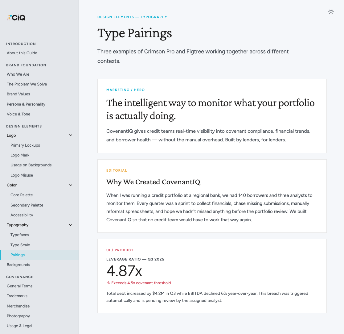
Typography pairings — Three usage contexts documented in the guidelines: Marketing/Hero (large Crimson Pro Light display with Figtree body), Editorial (Crimson Pro Regular with smaller Figtree), and UI/Product (Figtree-only with the tight numeric data display style used throughout the product — shown here with a live covenant breach example).
Deliverables
From brand concept to production-ready design tokens
All deliverables were created in Figma and built to serve brand and product simultaneously. The brand guidelines site was designed to be self-serve — every decision documented with rationale so engineers, marketers, and future designers could act without needing to ask.
- Logo system — Full horizontal wordmark, abbreviated CiQ logo, standalone icon mark, light and dark SVG variants for all contexts, plus downloadable files for each
- Interactive brand guidelines site — 22-section site covering brand foundation (mission, values, persona, voice & tone), design elements (logo, color, typography, backgrounds), and governance (usage policies, trademarks, merchandise, photography, legal terms)
- Color design tokens — All brand colors mapped as Figma variables with light/dark mode support, including full shade scales and WCAG-verified accessibility pairings, directly integrated into the CIQ design system
- Typography system — Crimson Pro for display and editorial contexts, Figtree for UI and body copy — with an eight-step type scale and documented pairings for marketing, editorial, and product use
- Marketing assets — Product marketing screens, social assets, presentation templates, and branded video meeting backgrounds for both light and dark compositions
Outcomes
A brand that launched with the product and scaled with it
The brand identity launched simultaneously with the product — unusual for a startup, where brand often trails the product. Because the design system was built on the same tokens as the brand guidelines, the product and marketing materials felt visually unified from day one.
Day-one brand consistency
Brand and product launched together, using shared design tokens. No visual debt accumulated from launching without a brand system.
Self-serve guidelines
The interactive guidelines site gave engineers, marketers, and agency partners direct access to specifications — reducing designer involvement in brand questions that previously required back-and-forth.
Adopted by engineering directly
Design tokens flowed from brand guidelines into the React component library, ensuring pixel-perfect brand fidelity in the product without manual translation.
Credibility with enterprise buyers
The refined, professional identity helped establish trust with regional banks and private credit firms — a critical signal in regulated financial services.